
- Process
Cracking That Nut: Bringing Pease Park’s New Brand to Life
Rebranding is a delicate process. It requires setting off into uncharted territory while paying homage to friendly waters. Now apply that metaphor to a squirrel.
When it came to rebranding Pease Park Conservancy, we set out to find the heart and soul of Pease Park a new place to play. Pease is Austin’s oldest park. It is active, diverse and host to Eeyore and his colorful friends on the last Saturday of every April, among other ongoing activities and new additions to come.
So we got to work. We explored new monograms and expected (and unexpected) iconography. We made acorns and trees in every shade of green. We made hundreds of squirrels. Not only was it important to nail the more traditionally iconic aspects of Pease, but it was also important to mine and develop logo concepts that come from another perspective entirely and introduce elements that were never a part of their current brand. In doing so, we can serve Pease Park Conservancy by presenting them both what they want and expect, and what they haven’t even considered. There is no right or wrong answer, just the one they choose.
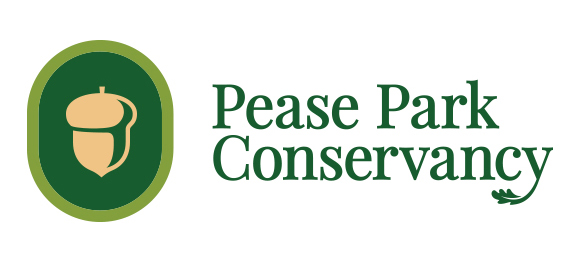
The Acorn
A simple mark to capture the natural beauty and elegance of the park. It is both organic and crafted; welcoming and sophisticated. A nod to the park’s history and revival. We wanted to really focus on the ‘conservancy’ side of the brand, something scholarly and a little more serious.
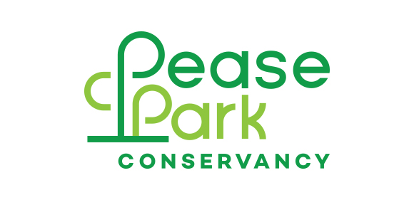
The Trees
A visual turn of phrase that connects Pease Park to its natural environment. This modern monogram is warm and playful–just like the Austinites who enjoy the park. Our focus was to create a modern brand that highlighted the trees of the park, and could also be dynamic and graphic within the execution of the full brand suite.
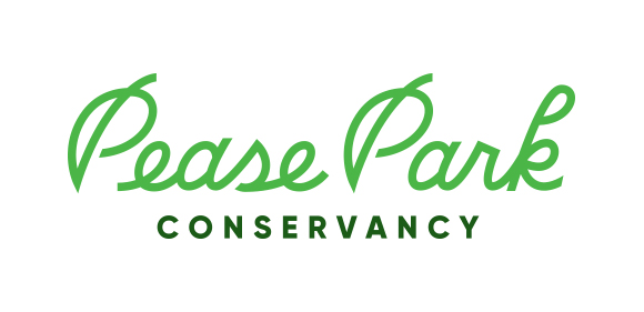
The Script
A modern refinement that connects Pease Park to nature in a timeless manner. Balanced by its colorful playfulness, this word mark welcomes Austinites to join Pease Park’s established and fun nature. We developed a custom wordmark that plays on nature as well, with the “P” of both ‘Pease’ and ‘Park’ resembling leaves.
The Hybrid Squirrel
A sophisticated evolution of the current logo. The mascot now embodies formerly disconnected elements of the previous logo to promote an engaging interaction with nature. This logo retains the squirrel but makes it a little more elegant and sophisticated, all with a whimsical twist.
The Chosen One
A familiar mascot with renewed energy motivated by all of the diverse ways Austinites enjoy Pease Park. It symbolizes a welcoming union in a beautiful natural setting. The most direct evolution from the current brand, we wanted to give a modern update to the squirrel and break it away from the acorn, and also pair it with a heavier wordmark that would complement the squirrel.
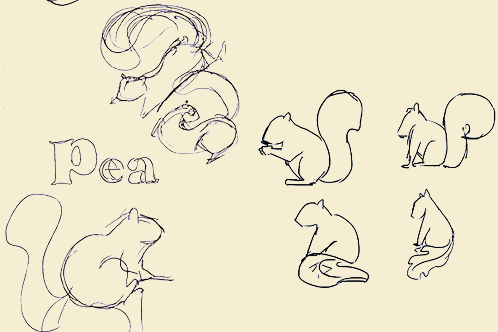
A deeper dive
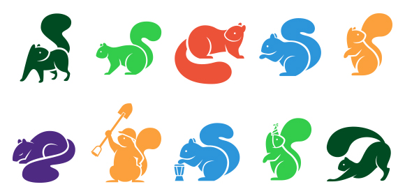
We started by making squirrels. Lot’s of squirrels.
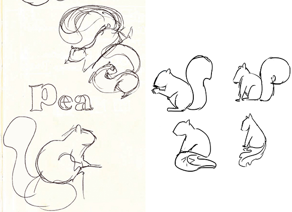
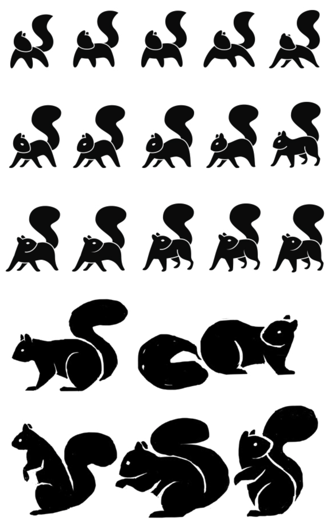
Some were calm and elegant.
And others were active and adventurous.
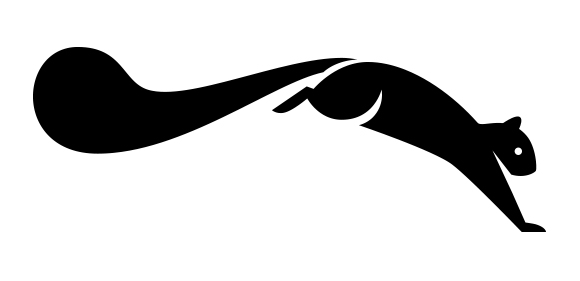
Paired with type, our leaping squirrel connected the park to the conservancy.
But squirrels do more than run around. Sometimes it may want to lounge, or play. Sometimes it may want to celebrate. Sometimes it just wants to find a tree and take a long nap.
So we made countless variations of our squirrel doing lots of fun things. We added a bold color palette to give our new squirrel all the energy it needs to be Pease Park Conservancy’s mascot.
We hope you enjoy the results, and Pease Park’s new brand.

Jeff Noel
Jeff’s got a reputation for invoking deep belly laughter – and laughing a lot himself. But jokes aside, the man’s got enough wisdom and wit to pencil his own anthology.
Sign Up For Our Newsletter: